


ALTEREGO'S PROFILE

"It's hard to find the balance when you are in love.
You're lost in the middle cause you have to decide between mind & heart."
― Enigma
You're lost in the middle cause you have to decide between mind & heart."
― Enigma
Search
Filter
 Image2.png
Mmh- Not bad, but that tile looks a bit weird for a road, at first sight I even thought it was a railway instead... xD Well, maybe if you just make a little wider it may look better, or perhaps you should try with some other tile, one without 'edges' if you know what I mean.
Also, shouldn't we be able to see the name of the person who is talking somewhere in the text-box?
Edit: Heh; I never thought such a small edit could make the road tile look so much better. :thumbsup:
Also, shouldn't we be able to see the name of the person who is talking somewhere in the text-box?
Edit: Heh; I never thought such a small edit could make the road tile look so much better. :thumbsup:
 The Screenshot Topic Returns
@Treeghost: http://npshare.de/files/0e4a5cc7/qwertz.PNG
Well, the old version looked good already and I see you're making improvements in the new one as well, the edges of the water are smoother now, but they still look kinda blocky imo but maybe that's how you want them. Anyway bests of luck with the remake.
@Liberty: http://i55.tinypic.com/ao7y9j.png
Nice map! =) I wonder why you didn't post it in the game page... Well, the lighting effect makes more sense now that we know the town will be darker in the early stages of the game, so it's natural for the light coming from the chimney to be brighter.
@Newblack: http://rpgmaker.net/media/content/users/8976/locker/RADmapscreen1.png
I have already commented on the general look of you game in one of your blogs so, I guess all I could add is that I like the reddish lighting effect you're using now, is definitively better that the dithering effect you were using in you other game.
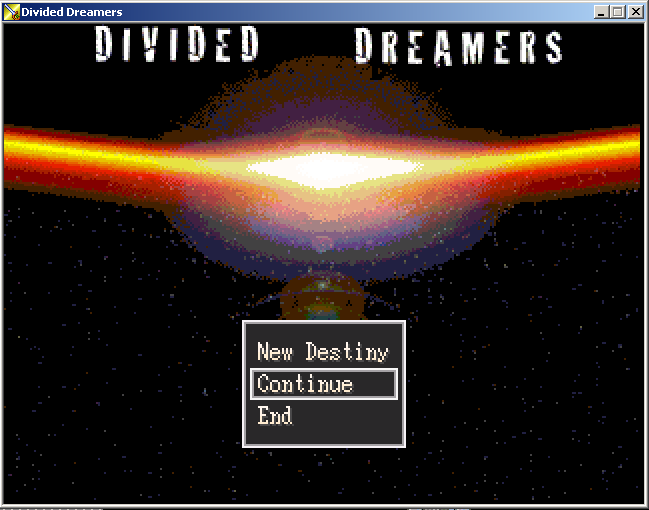
@Benos: http://rpgmaker.net/media/content/users/9830/locker/divideddreamers.png
Besides the poor quality of the image I think the title is placed too high on the screen, lower it a little or even make it the center of it all, the name and the font you choosed makes it far more meaningful/memorable than the galaxy background.
@Creation: http://img37.picoodle.com/i53q/freemind/eobn_8a4_u5vq6.png
To be honest I liked the other tree more, the foliage of this one makes it look too busy against the simplicity of everything else, besides, if the starts and moon have eyes shouldn't the trees have eyes as well? You see? there is no consistency.
Well, the old version looked good already and I see you're making improvements in the new one as well, the edges of the water are smoother now, but they still look kinda blocky imo but maybe that's how you want them. Anyway bests of luck with the remake.
@Liberty: http://i55.tinypic.com/ao7y9j.png
Nice map! =) I wonder why you didn't post it in the game page... Well, the lighting effect makes more sense now that we know the town will be darker in the early stages of the game, so it's natural for the light coming from the chimney to be brighter.
@Newblack: http://rpgmaker.net/media/content/users/8976/locker/RADmapscreen1.png
I have already commented on the general look of you game in one of your blogs so, I guess all I could add is that I like the reddish lighting effect you're using now, is definitively better that the dithering effect you were using in you other game.
@Benos: http://rpgmaker.net/media/content/users/9830/locker/divideddreamers.png
Besides the poor quality of the image I think the title is placed too high on the screen, lower it a little or even make it the center of it all, the name and the font you choosed makes it far more meaningful/memorable than the galaxy background.
@Creation: http://img37.picoodle.com/i53q/freemind/eobn_8a4_u5vq6.png
To be honest I liked the other tree more, the foliage of this one makes it look too busy against the simplicity of everything else, besides, if the starts and moon have eyes shouldn't the trees have eyes as well? You see? there is no consistency.
Wayfarer_MOCKUP_UPDATE.png
Now the outlined plus sign just looks like a stain against the cleanliness of the rest... Just use a normal one already! >_<
 Cool anime theme songs:
feliks.png
Whoa! This is some outstanding artwork! It almost looks 3D... I'm just wondering, are the decorations on it a completely original design or was it referenced from an actual weapon? Because I never thought guns could look this kick-ass back in the 17th century. Heh;
...Anyway, can't wait to see more of these. And kudos to your friend! =)
...Anyway, can't wait to see more of these. And kudos to your friend! =)
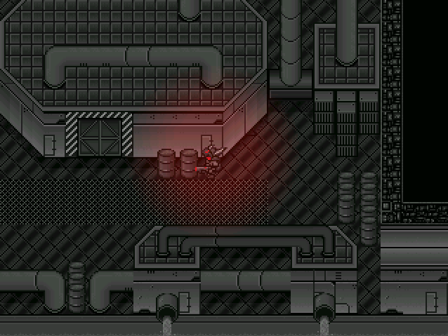
 ABS Fun Times: Respawning enemies and death effects.
Wohoo! Vaporized dogs! This looks very rad indeed, especially the mapping, I could never do maps this awesome using this chipset... The ABS looks very simple so far, but I guess you're not quite done with it yet. Here are some suggestions: What about having a secondary weapon, like a knife or something, just in case. Or the ability to launch a special AoE attack when you're surrounded. And why not a kind of energy shield to reduce/return/restore/whatever some of the damage taken. Stuff like that would be really cool to have when fighting hordes and hordes of radioactive dogs, I suppose...
btw, that little dog is too damn fast, I hate him already. X_x
btw, that little dog is too damn fast, I hate him already. X_x
ABS Fun Times: Respawning enemies and death effects.
Title.PNG
Mmh- I like the "Z" it looks like a crazy graffiti or something, the "ero" seems to be part of the same picture but I'm not sure. However what really bothers me is the word "base" that is just kind of pasted on top and with a font (times?) that is exactly the opposite of what this logo needs... You really need to change that.

