


ALTEREGO'S PROFILE

"It's hard to find the balance when you are in love.
You're lost in the middle cause you have to decide between mind & heart."
― Enigma
You're lost in the middle cause you have to decide between mind & heart."
― Enigma
Search
Filter
 What are you jamming to?
Favorite videogame world.
author=Feldschlacht IV
Give me Suikoden's massive, detailed, historied, and expansive world or give me death.
While I share the entusiasm, the world of suikoden it's pretty generic on the surface at least until three came out. You have towns, castles, forest, mountains, etc. the same old "medieval" stuff, only places like The grasslands and later most of Falena really do break the mold in my opinion.
author=YDS
Another example is Final Fantasy 8...
Hell yeah! I'm still in love with the design of the trains, gardens, etc. Everything is very well stylized with influences from many artistic currents. In fact, whenever I hear somebody boost about nowadays artsy-fartsy games I remind them that Square used to make art long before that.
_
I would also like to live in the Xenosaga or the Grim Fandango universe, well, I guess I'd need to be dead for the last one, but it would be worth it.. =P
 The Screenshot Topic Returns
author=Fist
do the charsets match the chipset?
Not really, they are damn cute though x) but you're using more colors to shade them than the chipset uses for each tile, also when compared to its blockyness your charas look much more stylized... besides that it's all good, see LockeZ's post.
Really Motivational Necessarian


 Titleb.png
Epic artwork is epic! ...however I think is kinda being ruined by the lettering(?) I like the main title, the effects on it make it look a little too busy but it's alright, but the part: "Tale of the two swords" should be a bit smaller (so the letters "ds" don't get over the rocks) and more plain looking, also, you definitively need to get rid of that thing on the back, it just gets in the way. Lastly, the "Developed by..." part should have no effects at all and take only like 1/2 of the width of the screen or less. ...Just sayin' ^^;
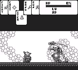
Final_Boss.PNG
author=InfectionFiles
Epic looking fight, very badass!
Agreed. Also, blurry... but I guess that's besides the point. xP
desktop2.jpg
I sort of agree with YDS, but I think her edit is insufficient. Just draw a line from between the characters's eyes and all the way down to her chin and notice how her nose and mouth are not properly center on the face... Actually, this is a problem in all your characters, so if you still have the original files you should fix that.
The Screenshot Topic Returns
@ashriot: http://rpgmaker.net/media/content/users/474/locker/aRPGscreen1.png
I like the simile with Diablo, it brings back memories; but I think the “pick your class†and the description texts should be smaller in size, right now it looks like you're trying to fill up space and that's not good.
@Blitzen: http://rpgmaker.net/media/content/users/62/locker/warlock.PNG
Whoa! That rocks. What is it for? A Cellphone? Anyway, like I said, it's looking very good so far, but I wonder if is as clean as you wanted it to be, you're using 10 “colors†when you could be using only four.
@Radschyte: http://img825.imageshack.us/img825/4808/mappypoo.png
Not bad, I like the tile distribution, just try to make the transition between grass and beach a little more gradual. In the character select screen try to center things better on the screen and use a normal font for the names.
@Lennon: http://rpgmaker.net/media/content/users/3235/locker/Yianyard.png
Kudos for making your own graphics. That looks fantastic! However, I think maybe you should brighten up the darker trees in order to differentiate them better from the grass and so they clash less with the clearer ones.
Whatchu Workin' On? Tell us!
I'm sulking to new age music, does that count? ...oh, and I begun translating the demo of my game, I was gonna release it in spanish first and then translate it, but screw the spanish rm communities, they (almost) never give good criticism anyway. xP

