@Red_Nova: Thanks~ Yeah, the floor has a lot more grey mixed in than Milla's jacket does, so it doesn't pop as much. I found that for tiles that are going to be darker, it helps to mix in the grey in much the same way that mixing desaturation into a screen tint can help with the graphics not being drowned out by the colours of the tint.
-------------------------------------------------------------------------------------
I'll get through all if them soon, but for now, feedback!
@Ocean
I've said it before but it bears repeating - those little tiles are super cute and totally bring to mind Legend of Mana (which I'm sure was the inspiration behind them). I think my favourite is the beach one.
Rubi is also looking really cute, though maybe you could let one or two pixels be normal skin tone on the knees so it looks a little less like a line across them? Otherwise she is cute as balls.
Fffffffffffffffffffffffffffffffffffffffffffff dem too cute for words. I am gonna have to buy all the cards over and over and over because omg cuteness!
I love the way the numbers just bounce like that. It brings some much needed animation to the scene (though I can see the animation for the sprites and they are cute, I just love all them bouncy numbers a lot!) I also really love the firefly effect and the background is gorgeous. Just... hnnnnng~<3
Those battlers are pretty neat, though I'd like to see how they look without the black lines (and just using darker colours) like you've done with the slime. They're definitely a good start.
The ship is a little too blocky - all straight lines - and looks a bit MS Painshippy (heh), but it's also a good start and I do like the fancy designs. I think the nose should be more pointed and less at a 45* angle, though - they were pointed in order to cut through the water and in-coming waves. Maybe do a little study on ships and why they were built in particular ways so you know how to design it and why? It could help.
The second ship image needs a little more depth to the width, I think, but I do like the look of it a lot, though the red part looks a little like you just scribbled on the darker colours. ^.^); It's looking neat, though. Also, try not to make your shadows quite so dark on tiles - the barrels, for example, really show what I mean. The bottom of the barrel is quick a bit darker than the top and it's a bit too 'heavy'. Try to lighten it a bit more OR add a bit of grey into it so it doesn't get carried away with darkness. It's currently quite emo.
The same with the larger crates in the town image - they're quite dark on the front, which would be decently lit enough to not be crawling in their own skins like that. So far you've a good start, though. Keep pushing~ ^.^)b
"A golden age of..." perhaps advancement instead of advanced?
I like the look of the pages and they add an extra dimension to the story telling, since their rips and tears tell a story all of themselves. I really like the idea of presenting your introduction story in this way - reports of the past by a historian. It feels more interesting than just scrolling text.
Oh ho ho! Is there a new April game in the making? I really like that background and the far back imagery, too, hinting to a larger town. I'm not a huge fan of Visual Novels, but I can appreciate a lot those who go to the trouble of making backgrounds for the different areas of them, as well as changing the characters' appearances. It shows a love of the game and dedication to their work. Also loving the wood patterns in the second shot. And the glimpse of the outside, too. And that stand with the food on it. And the food. Now I'm hungry. I assume that's food. Also, those flames are super neat and the decal on the fireplace is cool too. Dammnit, it's all so nice!
I'll admit I'm not a super huge fan of those tiles, but I do like what you've done with them so far. The house front is a bit odd, though, as it feels like the wall on the right should be another tile higher, but I'm gonna assume that it's an issue with not being able to see the roof in full.
The idea of using that parallax in the second image is an interesting one, though I'm not sure it works as well as you'd planned since the style clashes a lot with that of the sprites. It's an interesting idea, though, and if you were using a different style of graphics it might work a bit better. Still, the scene composition is quite good - if you could use the parallax as a base and map over it with the tiles of that set it might work to help you duplicate the shapes of the cliffs a bit. Or maybe try running a grainy filter over that particular parallax?
I'm not sure of the black frames on the side - I feel like they're not really necessary and that an all white screen would work better - but otherwise, it's simple and striking and does all you need it to do. I do worry that the pop-up choice menu will hide the bottom half of your clown, though, but centering him is the best design choice. Maybe use a script (if possible? not sure which engine this is in) to change where they pop up?
Those facesets are so cute it's not funny. Poor little grey guy doesn't smile at all, does s/he? Awww. As for the sprites, I have a feeling that their animations would be a bit stiff, but they also look quite cute. Maybe darken the shadow purple used in the floating sprite a bit since it looks a bit flatter than the others?
It doesn't look too bad, though those portholes are supposed to be used on the outside of the ship, not the inside. You should also move the picture up a tile (or reposition it a bit on the chipset so that it goes over 4 tiles and fits the wall better). You should also include some kind of place for the people sleeping in the beds to store their personal effects - cabinets of some kind. It is a bit empty but there's only so much you can do with ship tiles. PM me and I'll send you some bunkbeds I made for ships that you can see if you like the look of/want to use.
Oh, these look interesting. It'd be cool if the relevant information stood out a bit more (that being the stats) but I guess there's only so much room you have (though a small pop-up window or something when you hover over an enemy would be cool). Maybe make the range indicator a little more transparent? It does make the numbers a little harder to see.
First image: I'd recommend either getting rid of the wall on the outside of the room or putting walls everywhere (personally, due to the ground tile showing on the tile, I'd get rid of them and just leave it black). ALso, remove the raised ground near the entrance of the room. It looks awkward and wierd. I'd also question why there's a paved path in a cave where people die a lot (evidenced by skeleton), leading to a chest. It seems weird. As does the water placement. If you're having trouble filling a room up, try making it smaller.
Second image: The clash between tiles is a bit disconcerting. I recommend either committing to a larger grass patch and maybe some more trees, or removing them and putting something else there, instead of the patchy job that's currently happening. Also, you probably don't need a well when there's a lake around, especially for animals drinking ('lake' in bottom right corner).
Third image: Looks interesting. I'd question the random water all over the place, though, especially as it doesn't make much sense.
Fourth image: The houses are identical, which is fine if you have a lot of other different shaped houses around, but just pointing that out.
Fifth image: The HP/MP text is a bit small, especially when you've got so much room in that box that you could fill.
The Rule Variations screen looks simple but effective. The dice needs better centering in that circle, but otherwise it looks neat, though I'd think about maybe changing the text at the bottom so that it has a slightly darker or bigger outline/size. It's a little hard to read.
The amount of lines on the Adjustment page makes my eyes a bit crazy. Maybe you could change it so that the borders aren't quite as ... I'm not getting the word but let's just say all I'm seeing is lines and they're making it hard to read the actual text. It might be better to have only one border around the whole bunch of adjustments, and have alternating lines of colour (light grey, slightly darker grey) to denote the rule:adjustment?
Oh, I really like that a lot. (Though I'm one of those who subscribe to one tile high, one tile stair, so I find the multitude of stairs awkward.) The sand is a little bare - maybe some sand piles would help with that? Like the ones under hte cliff edges in the middle?
I feel like the fallen pine tree should be a bit flatter on the bottom, so it looks like it's been squashed under the weight of the trunk. IIRC, they tend to not have branches that stick out much like the other trees, so it'd be doing a sort of _\ thing, where the trunk weighs down the leaves.
Ahhh, rat is cute! His teeth and snout should probably be a little more turned to the right, since you don't see the right parts of his face but otherwise it looks great.
Think about your player and how much they will not like having to walk all that distance just tog et to a few rooms. Condense it down a bit, okay?
The rooms are just way too big. Even if you mean to have a set amount of people in that room at some point, it's just way too huge. For example, the room with the chairs could be cut right in half easily enough. Just make some edits for stacked chairs (like we used to do in school - stacking the chairs up into piles to make room). Or just remove them since extra chairs were always sent to storage. That would give you room to just cut out a huge portion of that room that need never exist.
You could widen the tech room by two tiles and then add all the computer desks in a row and get rid of the bottom areas and done, made that a bit smaller too. Those lockers at the bottom don't work that well, since they'd be opening towards the wall...
The last image is a lot more effective, but again, it's pretty big, especially given how small the teacher's desk is. You could probably use a normal table there instead. It's not just that the maps are big - they're also pretty bland. Try thinking about how to make them a bit better - what else can you find in classrooms? It's not just chairs and the teacher's desk.
You could probably make the Marks window a little wider (so that it the text doesn't look so squashed - or make the text one size smaller so it fits a bit better). I'm not sure how many drives there are on items but that box just floating in the nether is weird since everything else is aligned. I wonder if you could make a separate box for the Possession (and maybe add Equipped in it) and then have the stats by themselves and then the Drives box - and then have them lined up a bit better. There's still a lot of room in the image, it's just a matter of balancing it out a bit more.
It's definitely getting there, though, and most of it looks great!
Wow. There's a bit of style clash going on but I really like the colours in this and those cliffs are pretty cool (though they make no sense height-wise as far as I can tell).
The graveyard...if they paved part of the walkway, they would have paved the rest of it too. Rule of thumb - if it's paved part way it will be paved all the way - they don't just say 'let's skip this small part and drag our paving tools over it til we reach this area two steps away and restart here'.
Oh shit that's cute. Not sure about the Stalagtite just hanging off the wall like that since they have depth . Maybe if the top part was 3/4 cut away round to show that it's on the roof and not the wall?
I'm not very good at judging animations without seeing them in action but they look like they'd work well. I like the little gooey face thing. As for the monsters, damn, there's some messed up in there. Which is, of course, awesome. Pregnant eye lady will haunt me for the rest of the day ;.;
Oooh, maps~ Me likey. These look really cool. You should have a small easter egg of them in the game - say an image on the wall or something like that. It'd be neat.
I feel like there's something a little off in the waitress's pose. It might be her hand (which has six fingers, btw) being so large, or may she's bent over and reaching backwards (we were taught to always lean our bodies behind and away from the customer, so in this case, she'd be serving with her other hand, and at an angle where she'd be facing the customer in case they wanted to ask for something/engage. Showing your back was considered rude and unhospitable. Yeah, I did a waiting course (well it was front of house stuff so also Maitre'd and bar work - that kind of thing)). It'd also be hella awkward on her arms since food weighs a lot, especially when carting it around.
Despite that, I really like the shot a lot.
The battle system looks interesting. Also, carpets don't work that way (in the diner). I'd recommend having two - one leading in (and cut off a tile or two from the door) and one that is against the cash register area (where people wait in line). Also, your poor Barristas are trapped behind that counter forever. Overall it looks pretty cool, though.
It looks okay? Like a generated sprite, so it fits the RTP style well.
Goddamnit, another haunt-fest. These sketches look pretty promising. I like 5 for some reason, it reminds me of flames. The little cup monster is cool, too. And the dragon-type thing on the same page. They're all pretty cool. Seeing them complete would help a lot with understanding them better, like with the buttheart. Still, the design concepts are pretty neat.
That's actually a pretty neat little script, especially if you've got a random item generator script. It'd be cool if you let the developer add in a base for certain item times to the script, like say they want healing items handled differently to weapons, let them have a way to edit that in the script?
Youshould probably add a bottom edge of some sort to the carpet, so that it looks complete, and maybe some edging to the water so it looks like it actually has an edge against the floor/wall. otherwise it looks pretty neat, though the overall use of blacks is a bit darkening. It does kinda work, though. Oh, the battle is cool, too. Very minimalist. Maybe make the shadow for the eye creature a little darker so it stands out a bit more and doesn't seem so flat?
omg almost done orz and these are just images so far. I still ahve to do the other rest. orz
@Frogge
Sounds interesting and looks like you've got a lot of plans for it. It'll be interesting to see how it goes.
Not sure about the spraybrush N on the title screen. It makes it seem very amateurish. The window skin is a bit too hard to read the text on due to it being so busy, as well as light. It doesn't help that the font is very thin, even with the black outline.
Oh. Pearl ABS. I hope you're going to at least edit the assets and scaling in that script because while it's a great script, I've seen a lot of games where people just leave it default and that's not a good idea.
The arms on your girls are painfully thin. Sona, for example, look anerexic, despite having enough breast there to indicate actual fatty tissue being on the body. Hell her hips show that she should have padding enough for her arms not to be sticks. Same with Echo - she clearly has breasts of a large size, so unless they're fake, she should have arms that are a bit meatier. Otherwise, it looks well enough.
I could read most of those other screens. The maps are... pretty dull, sadly. There's a definite clash between some of the graphics and that dungeon is just empty of all life. It looks like you just hit 'random dungeon generator' and then added a start point and an enemy sprite, sorry to say. Keep trying, though. You'll get there. I'd recommend thinking about what you want the dungeon to be and then build it like that. A good idea is to give them a theme - say, Underwater Castle Dungeon, and then figure out how to show that in your mapping. Make lists of what you might find in that kind of area, then see how you can allude to that using the tiles you have on hand (and the ones that are available for use on both RMN and RMW, or that you can edit). You'd be surprised what a bit of brainstorming and effort can produce.
Not bad. I do ask how a one-tile-high area could have two-tile-high cabinets and pillars, though. Remember to keep an eye on consistency. You could also make that cooking room a LOT smaller and still have it contain the things you need to show. Currently it's quite large and it feels like you've added things just to take up space, instead of designing the room around the items it needs.
The second image is a big improvement, though it still looks like you've tried to fill an area instead of thinking about what you wanted and then making the room the right size. You're getting there, though.
Oh, that is a really cool drawing! I love the stilted effect and how it's being held up - it really adds a feeling of 'old and awkward' to the scene. I really like your style, too, though I'd recommend maybe making that dividing wall in the kitchen a tile or two lower. It's pretty neat.
I think it's all really cute and cool, but also the maps are quite bare and empty. Maybe think about the space a bit more - remember, your players are going to be walking around and wondering where to to and what they're supposed to do.
The colours are really nice, though, and the ideas for the tiles are interesting, too.
Interesting title screen. It'd be cool if you explored font options.
Carpets don't work like that. They're either full-room carpeting (wouldn't work with those pilars, though) or rectangles/squares. A runner would work best for the top part - two tiles, set below the statuary, running left to right. The blue carpet could just be gotten rid of altogether.
Again, carpets are your undoing. You should get rid of the brown one at the top, under the crystal. Cut the red one in the middle to the same width all the way through, until the bottom of the gold statue. Also, check out some shift mapping to help you with the carpets a bit more. Here's a tutorial:
https://www.youtube.com/watch?v=-xrhg70MXnQ
There's a cut-off in the lava screen of one of the stalagmites, near the switch in the top left.
Oooh, creepy! All of those sprites are deliciously shiver-inducing.
Oh god, I hope they all exist in the game with the sparkling ocean. That would be hilarious. (also, that is so pretty and sparkly!)
I'm not a fan of the grass tile much because you can see the grid very easily. Try making some of the details overlap into the next tile, then pasting that back on the original tile to fix that a bit. Otherwise, cute!
Oh god, I'll do the non-images later. I'm off to zzzz land.


 AraFellGreenlight_0000_TitleAraFellcopy2.png
 AraFellGreenlight_0001_TitleAraFellcopy.png
 AraFellGreenlight_0002_TitleAraFellcopy5.png
 AraFellGreenlight_0003_TitleAraFellcopy4.png
 AraFellGreenlight_0004_TitleAraFell.png
 AraFellGreenlight_0006_TitleAraFellcopy6.png
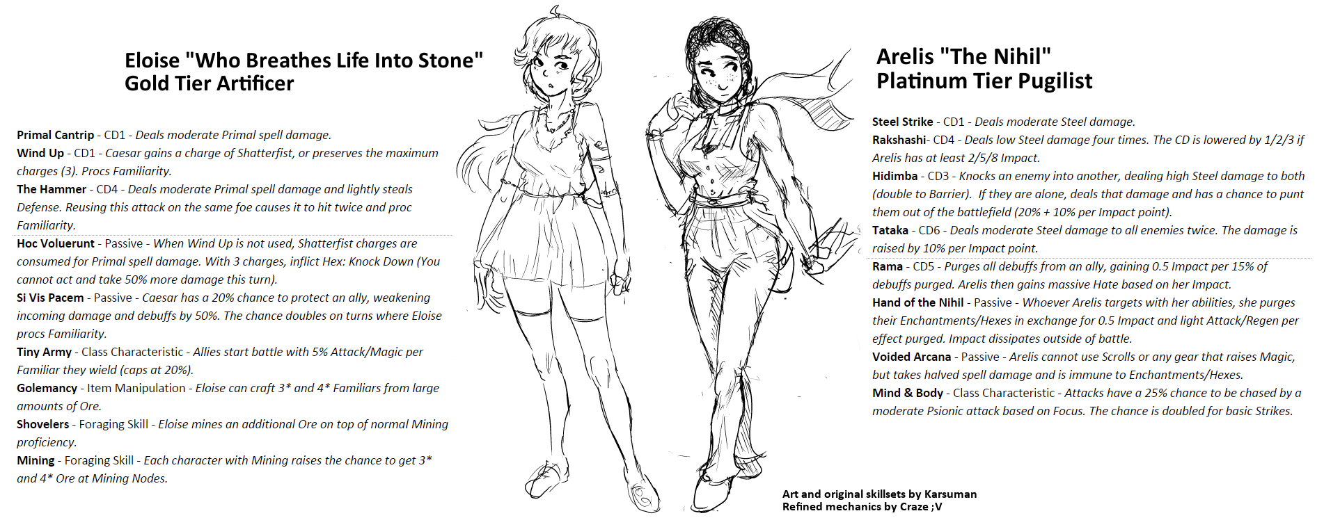 utVZj4G.png
 OverworldIconsRawr.png
 20160118_05050.png
 Eliciaattack3.gif
 01_Fairy_Spirit.jpg
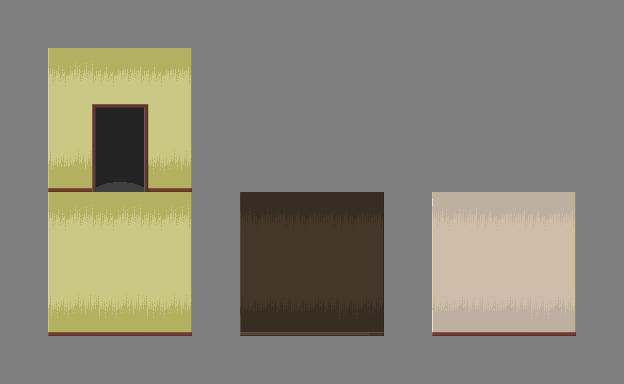 walls_and_door.png
 milla3.png
 milla_test.png
 milla_test_2.png
 Skill_System.PNG
 High_Kick_Skill_Card.PNG
 One_Inch_Punch_Skill_Card.PNG
 minty.gif
 Battlers_1.png
 Ship_Bridge_WIP.png
 Ship_1.png
 Port_Town.png
 INTRO_03.PNG
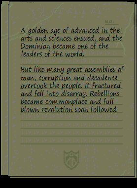 INTRO_04.PNG
 INTRO_05.PNG
 Screenshot_20160113_130013.png
 Screenshot_20160113_125854.png
 releasesomething1.png
 WeDroveThemOverTheCliffs.png
 FirstScene.png
 Menu.png
 Untitled.png
 KILL_THE_CLOWN_Title_Screen_Concept_Art.png
 FaceSets.png
 Screenshot_1.png
 Screenshot_2.png
 map01a.png
 map06e.png
 map08a.png
 t2.png
 t4.png
 t5.png
 tactics1.png
 tactics2.png
 tactics3.png
 GamePage.png
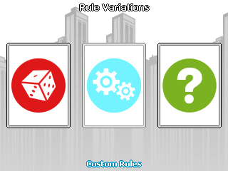 Rule_Variations.png
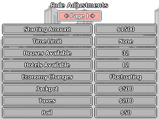 Rule_Adjustments.png
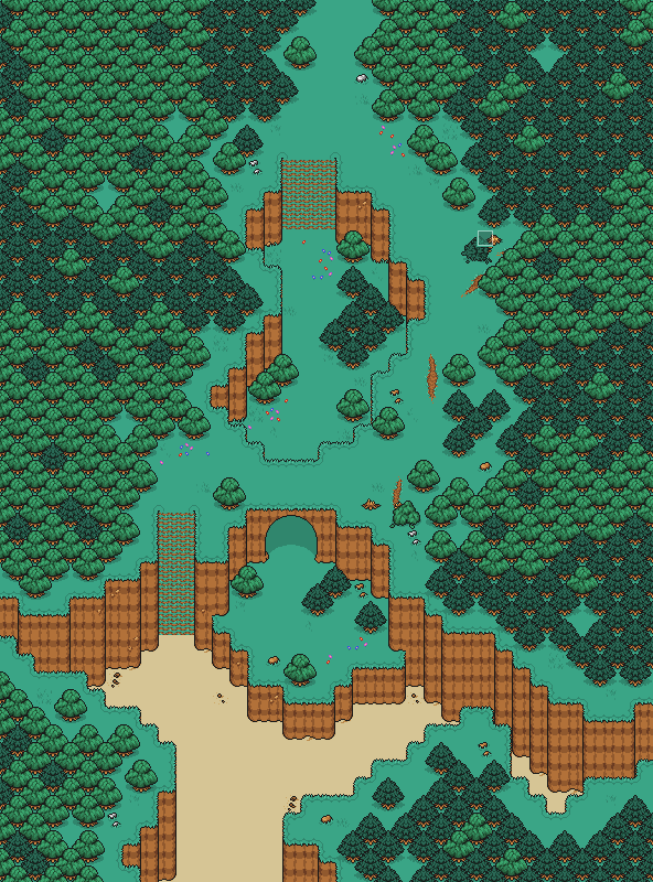 BeachWoods_2_Map.png
 CW_DevShot_8.png
 OWF_Sketch.png
 HolographicStnad.png
 Map010.png
 Chaos.png
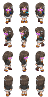 Kezia.png
 TheSerpent.png
 TheWeepingAngelEffectIsReal.png
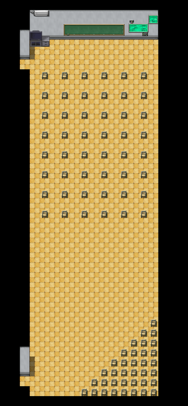 MMC_MultiMedia_Center.png
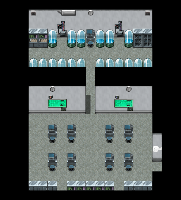 Tech_Room.png
 TRACE_System_1.png
 WhenTutorialsGoCanon.png
 WhyDidIComeBackHereAgain.png
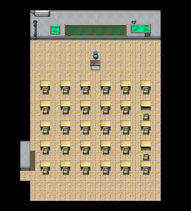 X__Xenarthra.png
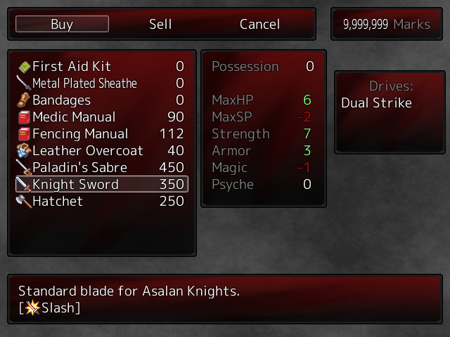 New_Shop_Menu_1.png
 Shop_Menu_tweaked.png
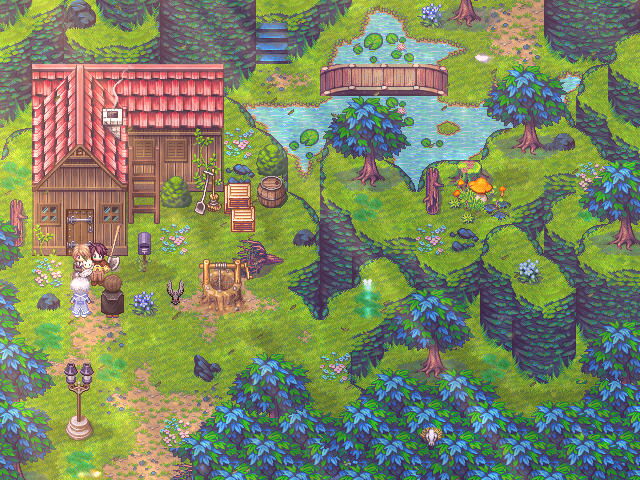 endhouse.PNG
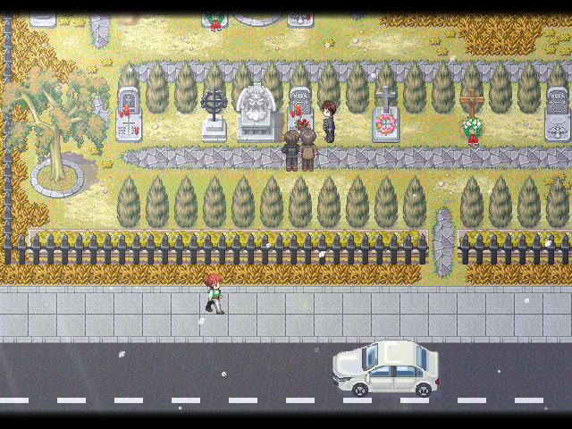 grave.PNG
 Blob2.gif
 Weird_And_Unfortunate_Battle_Animation1.png
 Weird_And_Unfortunate_Battle_Animation2.png
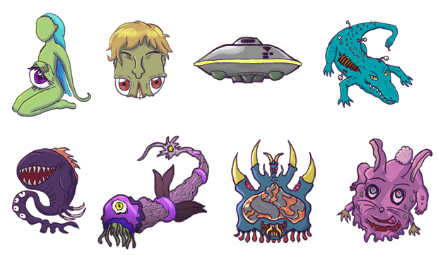 Weird_And_Unfortunate_Monsters.png
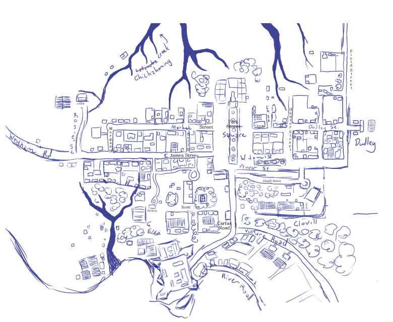 1760.jpg
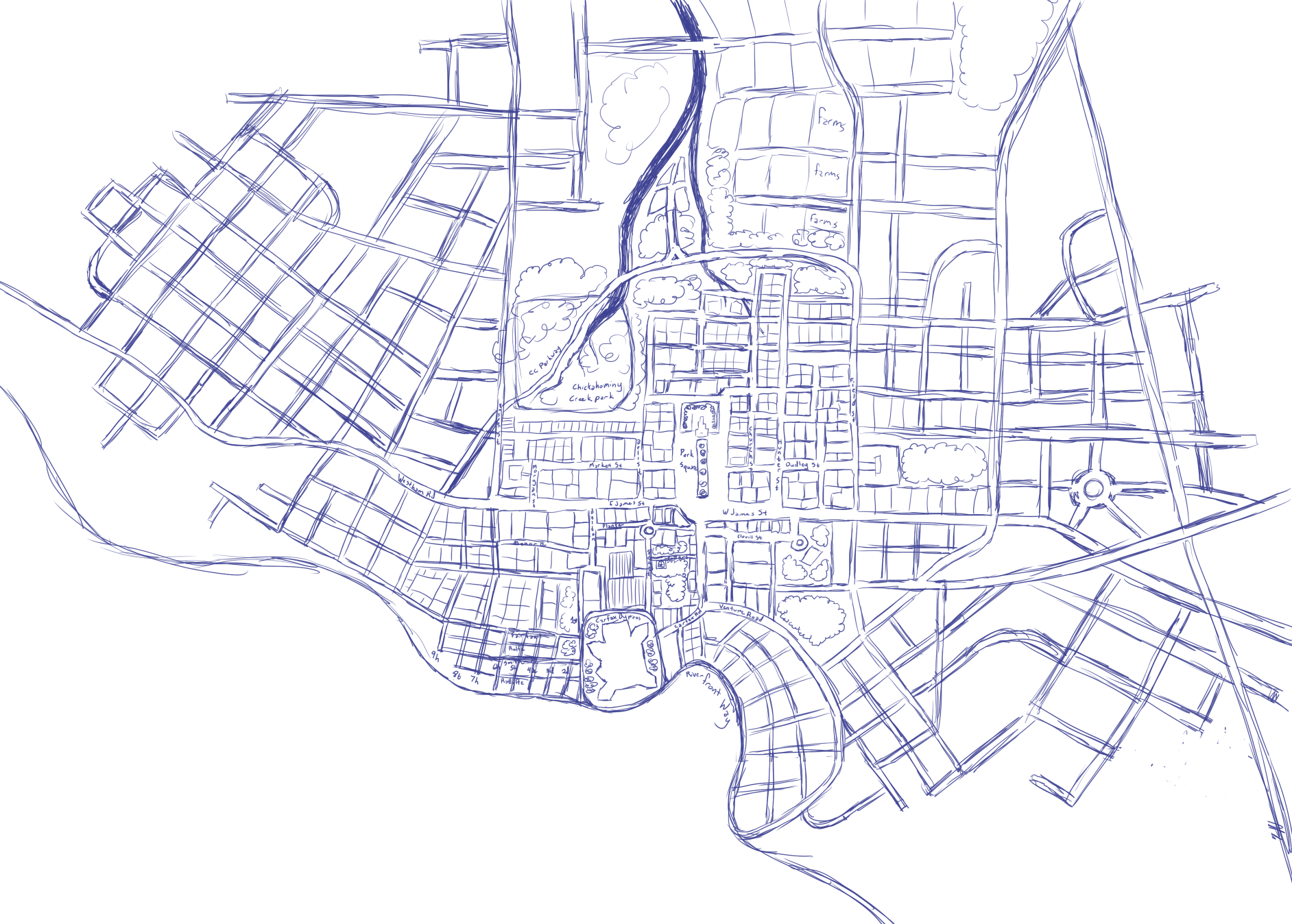 1947.jpg
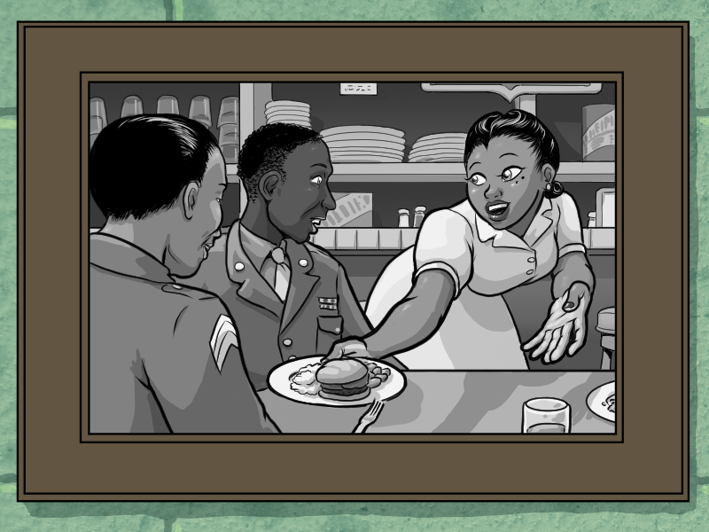 backgrounds.jpg
 SuperHomicideDetectiveTitle.png
 SHDApartment.png
 SHDBattleTest.png
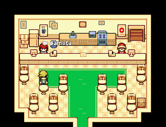 SHDCafery.png
 SHDCrimeScene.png
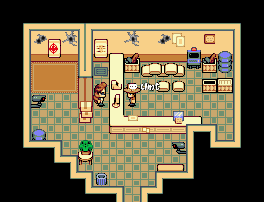 SHDGunnery.png
 SHDMap.png
 SHDMorgue.png
 SHDOutfittery.png
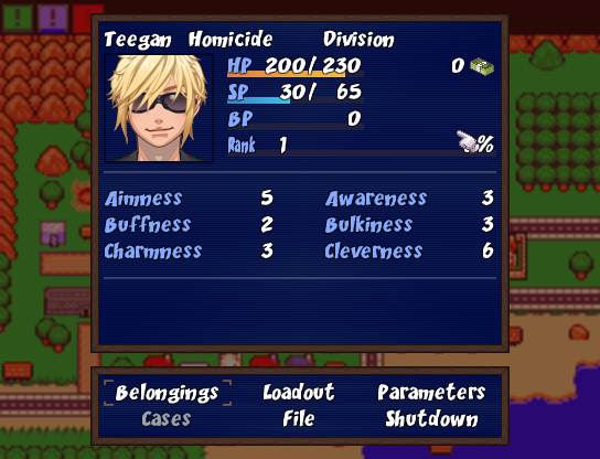 SHDStatusScreen.png
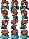 Issac_Swordsman.png
 SKETCHES_DREAMSCAPE_PHANTASM_COLLECTION.png
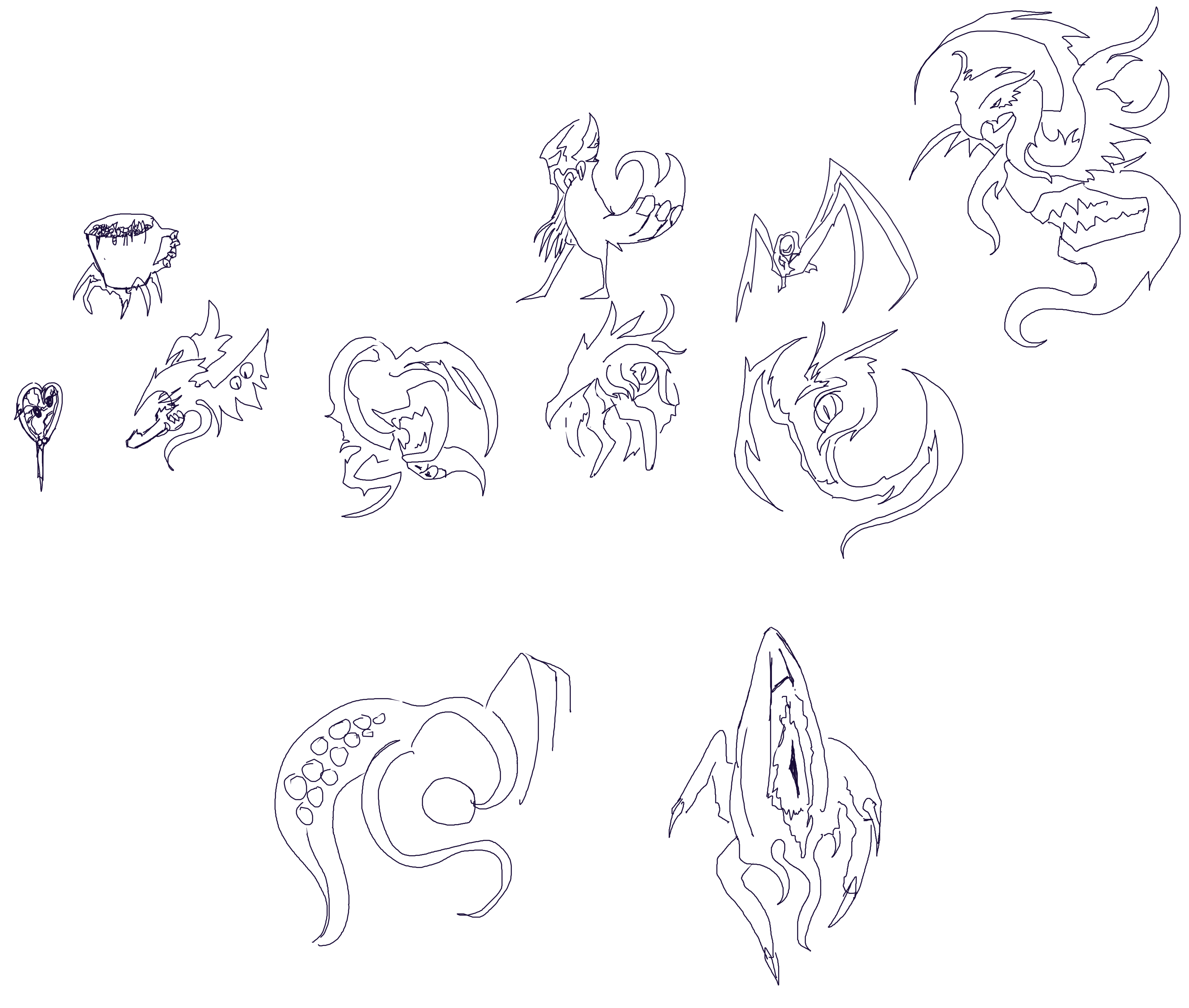 Sketch_Collection_2.png
 Sketch_Collection_4b.png
 Buttheart2.png
 Critter_Sketch_Collection.png
 sketch_collection_3b_1.png
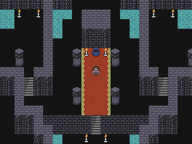 The_Keep.png
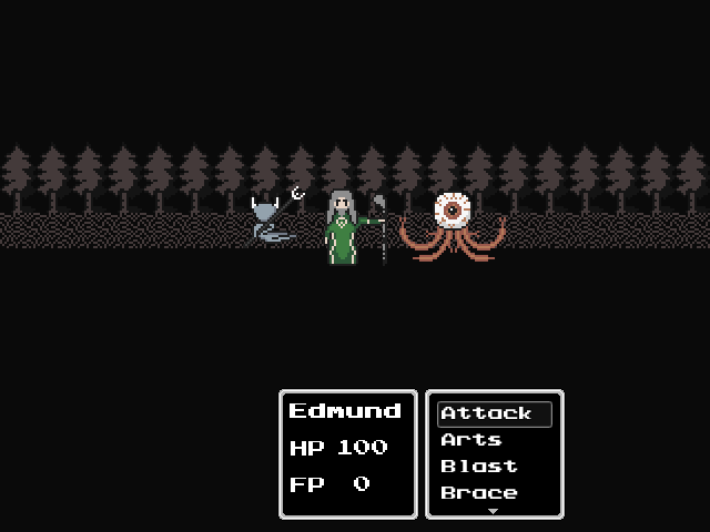 Battle_Layout_WIP.png
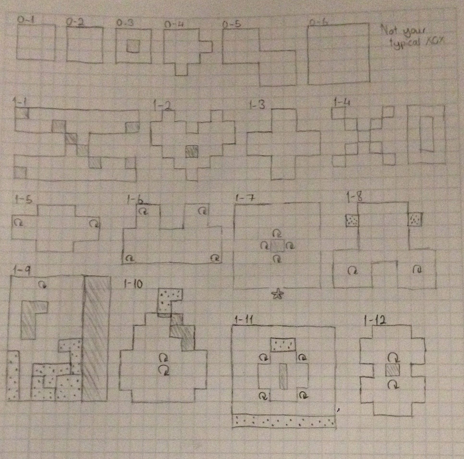 IMG_48771.JPG
 PowerUps.gif
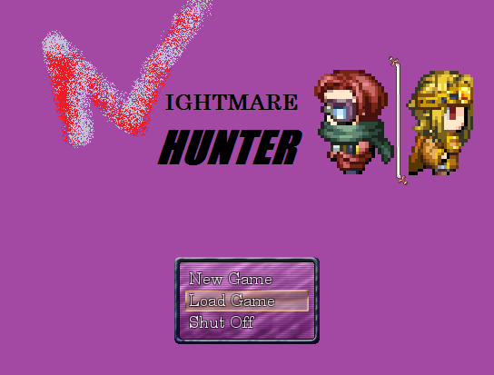 NightmareHunter_3.png
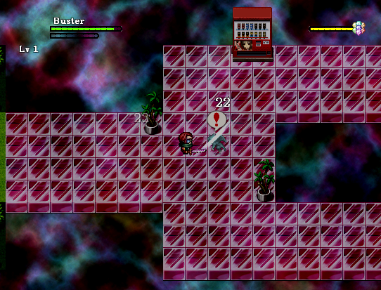 NightmareHunter_4.png
 NightmareHunter_1.png
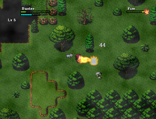 NightmareHunter_2.png
 NightmareHunter_5.png
 Test2.gif
 DrAxton_Normal.png
 Sona_Normal.png
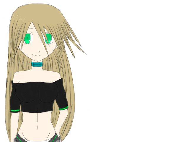 Echo_Normal.png
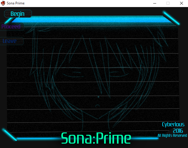 Title_Art.png
 Sona_Battler_1.png
 Screenshot01.png
 __38.png
 __39.png
 __40.png
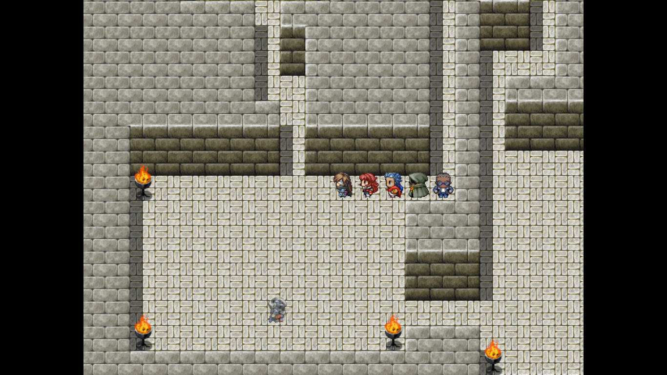 StealthSystem.png
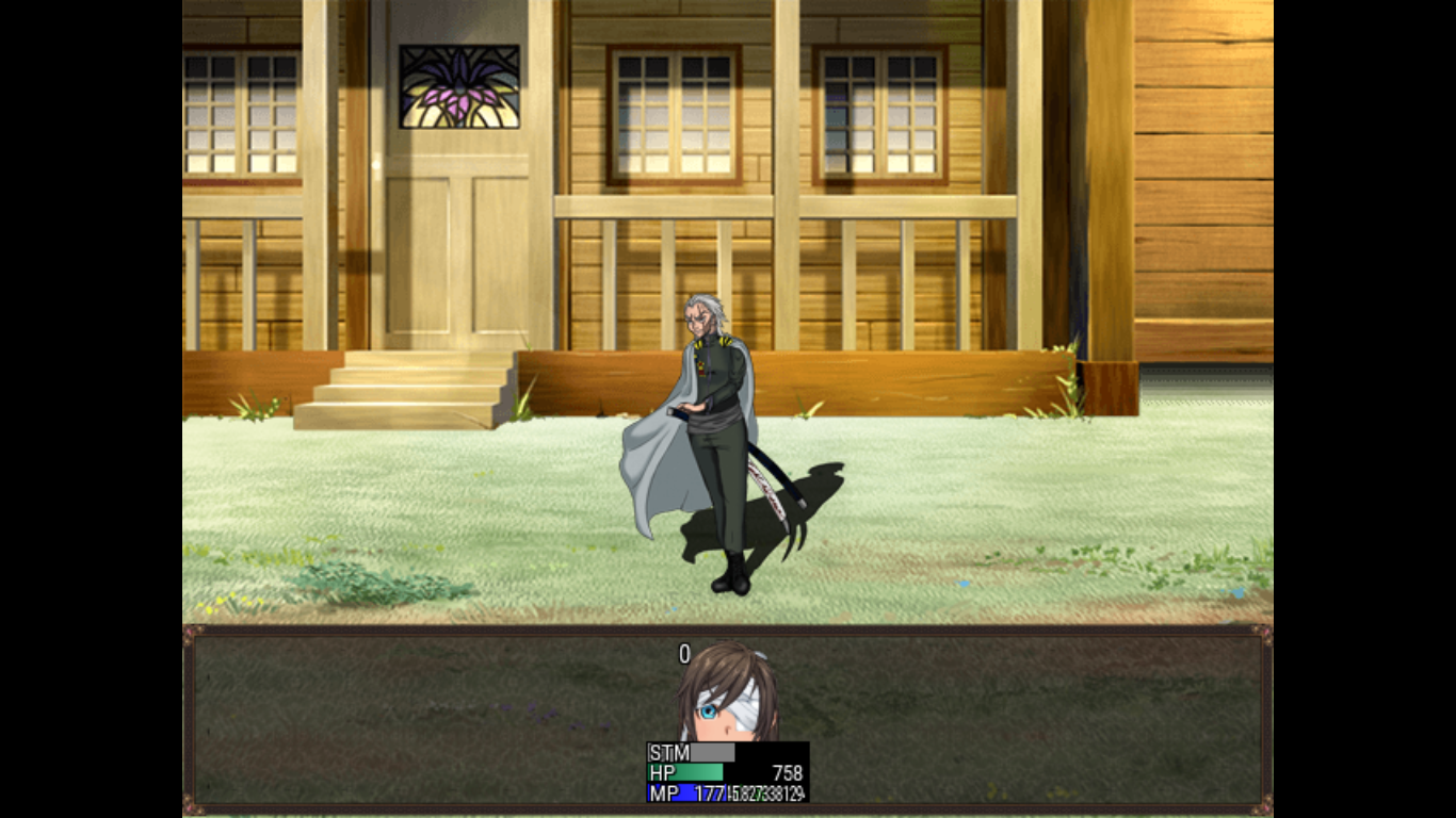 Rival.png
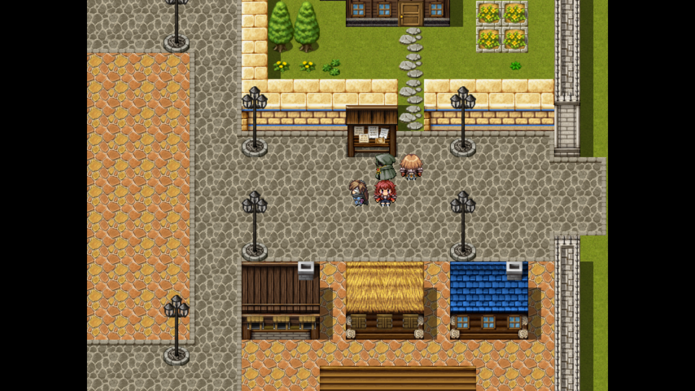 CeltiaInGame.png
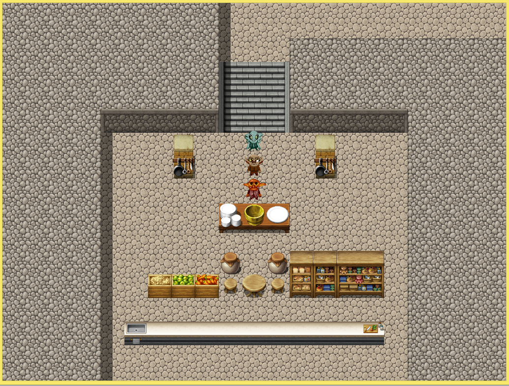 Cooking.PNG
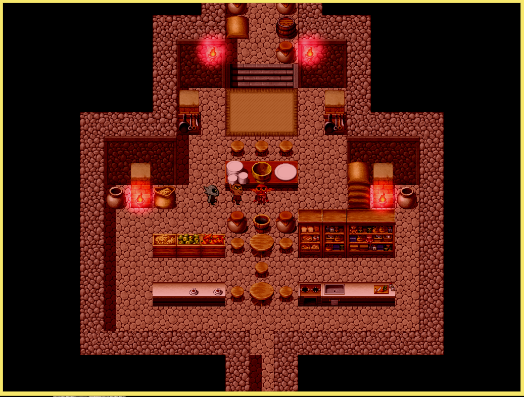 Cookingv14.PNG
 Cooking_v20.PNG
 maison_dvasion.jpg
 attic.png
 la_cuisine.png
 weird_geometry.png
 better_gemetry.png
 waterfields.png
 better_weird_geometry.png
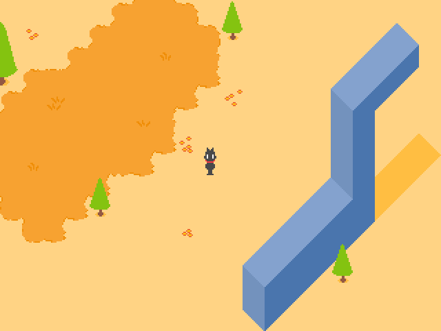 monument.png
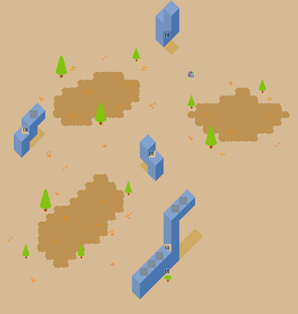 unfinished_map_layout.png
 title.png
 wordbubbl.gif
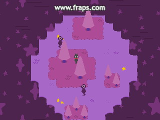 starworld.gif
 1.png
1.png 2.png
2.png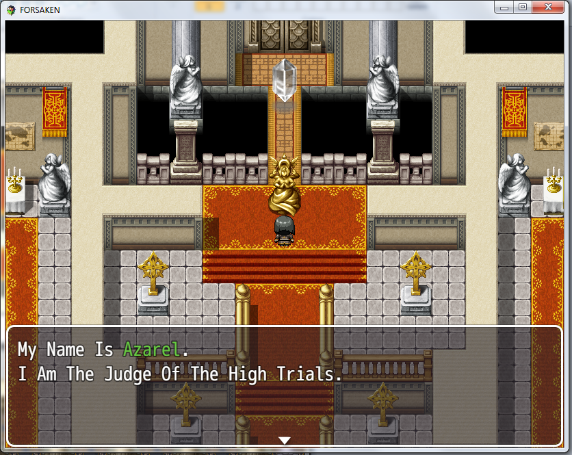 3.png
3.png 4.png
4.png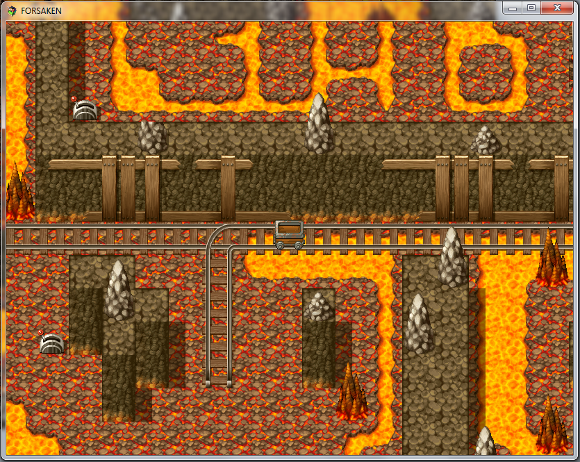 5.png
5.png J0e.png
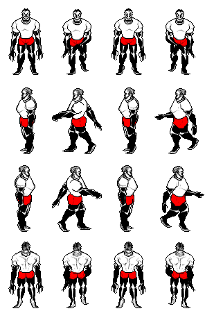 Coach_Imani.png
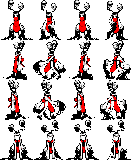 Art_Teachers_Kama_Ananta.png
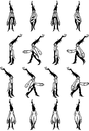 Music_Teacher_Amna.png
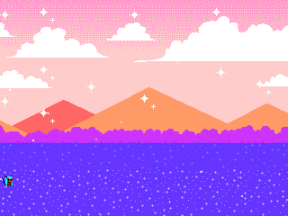 clip0010.gif
 clip0003.gif


)