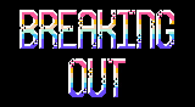
But I think the "INFO" option is too close to the bottom grey squares. It makes the option harder to isolate since it's using a smilar colour and too near the bottom.
author=iddalai I like the side bricks! Gives it a new appeal.
But I think the "INFO" option is too close to the bottom grey squares. It makes the option harder to isolate since it's using a smilar colour and too near the bottom.
I'm trying to keep text locked to an 8x8 grid for the most part, so moving it away from the squares would actually look a bit inconsistent?
I think What I'll do is ditch the gray squares entirely and just build this title out of the bricks, leaving space at the bottom for the "INFO" text to shine. Thank you for the feedback!
author=Ratty524 I'm trying to keep text locked to an 8x8 grid for the most part, so moving it away from the squares would actually look a bit inconsistent?
I think What I'll do is ditch the gray squares entirely and just build this title out of the bricks, leaving space at the bottom for the "INFO" text to shine. Thank you for the feedback!
I see, 8x8 grid consistency makes sense.
May I suggest only removing the grey squares from the bottom and top? That way you'd get the best of both worlds since I think the grey squares give it charm.

 Add Review
 Subscribe
 Nominate
 Submit Media
 RSS
RSS