


SPACE IN THE MAPS
Posts
Looking around and seeing people talk about maps, there's something that people call open space. There's too much open space here and there, or there's too this or that. How is the maker suppose to know what is considered too much open space. Even if the maker is able to reduce the space, there are times when they can't either because of map effect, or trying to edit a map already made, and the map can't be altered any more. Do we even care about open spaces? There are a number of commercial games that have too much open space. Why should it matter here? And if it does, how might one improve it, without sacrificing the work that they already put into a game? Food for though anyone.

I guess it depends how one is called out for open space. If someone drops by and says "Hey, this map is too empty!" without a follow up of what it could be filled with, or at least how the map could be made better with being smaller, that isn't really helping a developer.
Of course, what makes a map "good" is another debate all together. Personally, I don't really notice mapping unless I find myself walking through tiles that I believe should be walls. Or run into walls where the tiles otherwise suggest passage.
Of course, what makes a map "good" is another debate all together. Personally, I don't really notice mapping unless I find myself walking through tiles that I believe should be walls. Or run into walls where the tiles otherwise suggest passage.

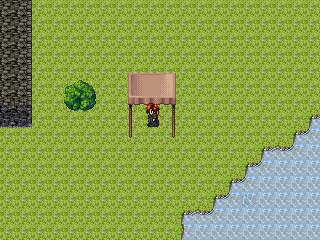
Empty space isn't the issue; it's pointless space that's not so good. Usually it's an interior map or something and it fills the entire screen for no good reason. For instance, let's check out this map from one of my first projects:

That's supposed to be the inside of a tent. Why the hell is it that large on this inside? Is this tent actually a portal to this spacious abode? And what sort of room in general can you put ten full-length beds together and still have room? The proportions don't make sense.
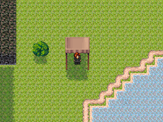
Here's a different sample case:

It's got just as much empty space as the first one, but nothing pointless. There's a bit of variance in the lower chip so it's not boring, and the size of the room makes sense because it's a cave and not someone's house.
...Also, "commercial games do it" is not an excuse for anything. There are plenty of commercial games that require the player to grind for hours on end as well. Guess what? I don't play those games. Plenty of games also have poor mapping. That doesn't mean you shouldn't aim for good mapping.
If you're concerned about how much effort it will take to fix maps on a finished project... just don't do it. Start a new project. Every game (and every map, sort of) is a learning experience. Just carry on making games and keep improving. (also I don't really care a whole lot about space issues anyway)
That's supposed to be the inside of a tent. Why the hell is it that large on this inside? Is this tent actually a portal to this spacious abode? And what sort of room in general can you put ten full-length beds together and still have room? The proportions don't make sense.
Here's a different sample case:
It's got just as much empty space as the first one, but nothing pointless. There's a bit of variance in the lower chip so it's not boring, and the size of the room makes sense because it's a cave and not someone's house.
...Also, "commercial games do it" is not an excuse for anything. There are plenty of commercial games that require the player to grind for hours on end as well. Guess what? I don't play those games. Plenty of games also have poor mapping. That doesn't mean you shouldn't aim for good mapping.
If you're concerned about how much effort it will take to fix maps on a finished project... just don't do it. Start a new project. Every game (and every map, sort of) is a learning experience. Just carry on making games and keep improving. (also I don't really care a whole lot about space issues anyway)

As a rule of thumb, make maps smaller. Empty space = having to walk more from A to B for no reason. It doesn't look good, doesn't help with anything. Sometimes you need space just for matters of realism... you wouldn't have a whole continent inside a 20x15 map. But just because it's a continent, it doesn't have to be a 400x300 map. And if you do need to make a bigger map, put stuff in it. Trees, boxes, rocks, whatever.
LockeZ

I'd really like to get rid of LockeZ. His play style is way too unpredictable. He's always like this too. If he ran a country, he'd just kill and imprison people at random until crime stopped.
5958
author=calunio
As a rule of thumb, make maps smaller.

There has to be purpose in adding space in maps. One best application is when monsters are visible in the dungeon; battles only occur on contact unless mixed in with random encounters for the feel of enemy ambushers. If the enemies are too weak and more of a nuisance, some maneuvering will let the player leave the dungeon without meeting one, while a grinder would like to meet them head-on, then reenter the map when it's empty.

Well, showing off cool chipsets is always good, and so is atmosphere. If you can make a large map well, go for it.
But nobody likes that guy who has like fifty 500 by 500 maps that you have to trek back and forth through.
But nobody likes that guy who has like fifty 500 by 500 maps that you have to trek back and forth through.
LockeZ
I'd really like to get rid of LockeZ. His play style is way too unpredictable. He's always like this too. If he ran a country, he'd just kill and imprison people at random until crime stopped.
5958
A single 50 by 50 map that you have to trek back and forth through is about my limit.
To get more to the heart of the subject, the reason empty space is bad is because it does nothing to interest or engage the player. The player needs to be mentally engaged in every step of the game - good area mapping is a very key part of doing this, since the player will spend a pretty good chunk of the game walking around. Cut out the parts that aren't interesting. In an RPG, the appearance and layout of areas doesn't affect combat, and in fact doesn't typically affect gameplay at all, so the only purpose of a map is to be interesting to the player. Which means that any part of a map that's not interesting serves no purpose.
If you realize you have an empty space, you have two options. You can condense the area, or you can put something there. I usually prefer the latter. This 30x20 grass area is meaningless - let's put a giant 50-meter-tall magical spire there, surrounded by entranced summoners, one of whom possibly sells herbs or something. This 12x10 dirt section has nothing in it - let's put an abandoned rackled-down guard tower there, surrounded by spikes. This castle hallway is empty - let's make it look like a giant explosion happened in it and destroyed half the wall. These are major objects but don't have to have any story behind them. They can just be there. They make the player look at them and think, "Hmm, that's kinda interesting, I guess." Whereas, without them, the player just looks at the map and thinks, "I wonder how long until I get out of here."
Not making large empty spaces unless you have a special reason for it, is one of the rules I recommend learning, even if you don't want to focus on mapping. Putting more details takes time, but making maps small does not take more time than making them large. Large empty spaces also adds traveling time for no good reason at all. So, open space usually makes maps more boring, both visually and functionally, without adding any positive benefit to it.


Nice to know this game gets away with breaking this rule... though its more of a matter of "interactive space."
The problem with that map isn't even spacing. The tile usage is just completely messed up and it's impossible to tell where the walls or the ground are.

author=arcan
The problem with that map isn't even spacing. The tile usage is just completely messed up and it's impossible to tell where the walls or the ground are.
who gives a shit, you can tell where you can and can't go.

author=LockeZ
A single 50 by 50 map that you have to trek back and forth through is about my limit.
Iconic areas like Zozo or South Figaro would have sucked cock if they were 50x50.
author=Darkenauthor=arcanwho gives a shit, you can tell where you can and can't go.
The problem with that map isn't even spacing. The tile usage is just completely messed up and it's impossible to tell where the walls or the ground are.
No actually I can't and I'm not even joking. I just now see it after looking at it for a few minutes.
Thanks for the impute. I agree about the commercial games comment being an excuse, but I also agree that if not given advice about how to improve mapping then there's no way to improve, which is why I started this post. The feedback has been very helpful.

author=Verincia
Thanks for the impute. I agree about the commercial games comment being an excuse, but I also agree that if not given advice about how to improve mapping then there's no way to improve, which is why I started this post. The feedback has been very helpful.
Well I wouldn't say that there's no way to improve. It may just be that the commenter was too lazy to be bothered to suggest ideas or figured that as it's your game you should figure it out yourself.
That said, personally I try to keep maps small. So about 3-4 smallest sized maps for a dungeon, or at least the main road of the dungeon with maybe a larger map or two for optional areas. Larger maps should be interesting to the player walking through them. It's easy enough to do, too. You don't need to be able to go everywhere on the map, you can block access to some areas so that it's more realistic.
That said, larger maps are probably best for things like mountains or winding areas (do not have random encounters for these, for the love of God!!!) whereas I would never use large maps for the insides of houses - unless it's the entrance of a castle/manor and even then fill it up a bit.

Like anything else the best method is to ask yourself questions, namely:
Why is that there?
Should it be there?
How large is this?
Can I get through?
What is the purpose of that space/area.
Don't ask yourself the artsy questions: "Does it convey this message..." etc. Too early on, because that's not necessarily a logical question. If you are going for a mood, make sure the room is also functional before doing so. You can always edit a well-designed room than muck with a bad one.
This tactic can be applied to everything you do and is my general rule of thumb. I don't let numbers fool me. A room can be any size so long as you have mental background as to why its that large. A battle can last any length of time as long as you have the precedence for such a time-drop. Creativity isn't necessarily as important for me, but that's just me.
Generally children/teenagers don't have this as fine tuned as adults which is why they can produce bad games. Like: "Would it be cool to kill the player off here automatically!?" A seasoned person would say, "it's never a good idea," while an unseasoned person would say, "that's cool!" Some common sense and practice is all I can say.
(This is the same method psy_wombats used to dissect his early screenshots). Just do it while you're editing and not after. ;)

author=Darkenauthor=arcanwho gives a shit, you can tell where you can and can't go.
The problem with that map isn't even spacing. The tile usage is just completely messed up and it's impossible to tell where the walls or the ground are.
Not at a glance you freaking can't. I don't even know how that character got on that tile.

Hope this helps!
Adding On
Alright, I’m going to start the adding on section. Also, I’ll be doing an interior design to houses and castles, as well as caves soon enough.
Shadowing and Fading
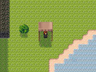
This is just one small add on that I want people to see. A lot of people have boring maps like this:
This makes me cry people. With only a few extra seconds of work, you can make it look a million times better. Let’s start with the most basic of add-ons, Shadowing and Fading. By adding a darker grass to places, you can make a shadow effect. By adding sand to the water there, you can add a water fading to land effect. See here:
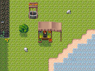
However, you will easily notice a bit of a problem there. The fact that the shadows and fading don’t line up. This is where a key that not some many people know about comes in. It’s called THE SHIFT KEY. By holding down the shift key and placing the tile where you want it to be, the ground tile you selected will take up the whole square. Example:
OH NOES! They don’t fade in now. That, however, is a solvable problem. Simply by going back over the tiles next to the places where you want the tiles to fade in, you can create the fading effect that you want. Example:
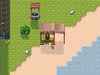
Now, you’ve got a much nicer looking map. It’s not nearly as boring as it was, even though it’s still pretty boring. Now, we can add more to it.
Objects are the second layer of a map, and are very important. Simply be placing a few random objects on a map, you can make it looks loads better. Example:
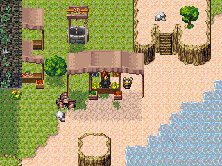
As you can, the map is beginning to look a lot nicer. Now, what you’ve got to do is link the objects together somehow. By reshadowing, drawing paths, and refading, you can achieve this. Example:
By adding more and more objects and changing the map some to suit the object placement, your small area can begin to take a new shape, much like this:
However, if you’re like me, you’ll notice a few problems. First, because objects can’t overlap, there’s some spots that are missing things. Also, a few rules have been broken, like the squaring of land and the crowding of space. Some things will still have to be changed, but this is all we can do with just objects. Now we need… EVENTS!
Eventing is the most important part of all. By adding second layer events over objects, you can get the image of two objects. By adding birds and animals, you can give life to your maps. By adding people, you can purpose. Check out this fully changed and evented map.
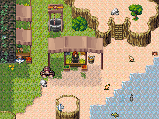
As you should be able to see, the change from beginning to end was drastic. That’s all it really takes, and isn’t that hard to do at all.
...
Alright, I’m going to start the adding on section. Also, I’ll be doing an interior design to houses and castles, as well as caves soon enough.
Shadowing and Fading
This is just one small add on that I want people to see. A lot of people have boring maps like this:
This makes me cry people. With only a few extra seconds of work, you can make it look a million times better. Let’s start with the most basic of add-ons, Shadowing and Fading. By adding a darker grass to places, you can make a shadow effect. By adding sand to the water there, you can add a water fading to land effect. See here:
However, you will easily notice a bit of a problem there. The fact that the shadows and fading don’t line up. This is where a key that not some many people know about comes in. It’s called THE SHIFT KEY. By holding down the shift key and placing the tile where you want it to be, the ground tile you selected will take up the whole square. Example:
OH NOES! They don’t fade in now. That, however, is a solvable problem. Simply by going back over the tiles next to the places where you want the tiles to fade in, you can create the fading effect that you want. Example:
Now, you’ve got a much nicer looking map. It’s not nearly as boring as it was, even though it’s still pretty boring. Now, we can add more to it.
Objects are the second layer of a map, and are very important. Simply be placing a few random objects on a map, you can make it looks loads better. Example:
As you can, the map is beginning to look a lot nicer. Now, what you’ve got to do is link the objects together somehow. By reshadowing, drawing paths, and refading, you can achieve this. Example:
By adding more and more objects and changing the map some to suit the object placement, your small area can begin to take a new shape, much like this:
However, if you’re like me, you’ll notice a few problems. First, because objects can’t overlap, there’s some spots that are missing things. Also, a few rules have been broken, like the squaring of land and the crowding of space. Some things will still have to be changed, but this is all we can do with just objects. Now we need… EVENTS!
Eventing is the most important part of all. By adding second layer events over objects, you can get the image of two objects. By adding birds and animals, you can give life to your maps. By adding people, you can purpose. Check out this fully changed and evented map.
As you should be able to see, the change from beginning to end was drastic. That’s all it really takes, and isn’t that hard to do at all.
...

